On this Page
- Introduction
- Units of measure
- InDesign preferences
- Book Design and the Page
- Book Size
- Text block and Margins
- Baseline Grid
- Paragraph Styles
- Drop Caps and Nested Styles
- Paragraph Alignment and Spacing
- Poetry, Verse and Song
- Keep Options
- Widows and Orphans
- Further Details in the text
- Typographer’s Quotes and Apostrophes
- OpenType features
Attention to Detail in Typography with InDesign
Introduction
Pages, Grids, Typography, Spacing and Alignment
InDesign is a brilliant tool to design the display of type on a page. We have every possible control over the letters, the words, the lines, the paragraphs and how the blocks of type are shaped, spaced and aligned.
To have full control over the typography in our books, we need to become familiar with all aspects of type and be ever critical of the smallest details.
We should not leave anything to chance!
Units of measure
Before we begin to discuss book design, pages, margins and how to set them up in InDesign, we need to get an understanding of units used.
Page sizes are measured in worldly units like millimetres or inches. We* (in the UK) prefer to use metric units like millimetres. In typography for print type and leading sizes are measured with the point (pt). A single point measures 0.352777778 millimetres, so you can see that relating page size to point size is very difficult. Fortunately, InDesign allows us to enter point sizes directly into the paragraph styling dialogue for spacing and indents. We do this by entering ‘pt’ after the number. For example, if we want a 16pt first line indent, then we enter this in and InDesign will convert to an exact millimetre size.
Note: If you read any of the Adobe Classroom books on InDesign, the units there are in Picas. A Pica is 12pts so if you see 2p10 this means 2 picas + 10pts or – 34pts.
InDesign preferences
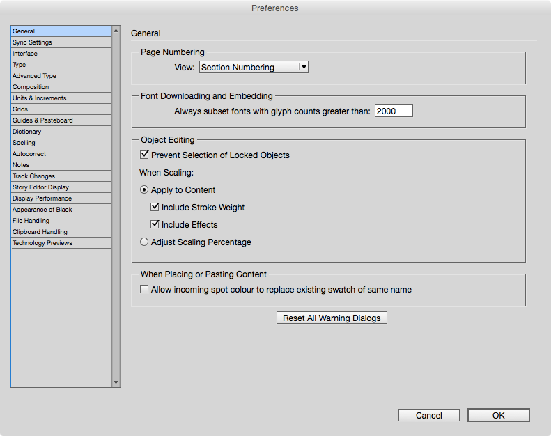
You can set up your preferences for the units that InDesign uses, as well as many other behaviours by finding the menu under the far left InDesign CC item. Please be aware, that the settings you make without any document open, will thenceforth be your default preferences. On the other hand, when you make changes to the preference setting when you have a document open, then those settings are for that document.
Book Design and the Page
One of the first things we will be doing is deciding the size of our book and then how to arrange the text on the page.
Book Size
Have a look at the books on your shelf or in the library. They come in all shapes and sizes don’t they? Well actually do they really? If you look carefully (maybe with a measuring tape), you may spot that there are some books that are the same size. This is because there are certain adopted standards mostly for reasons of economy.
Since paper comes in standard sizes, it makes sense to set the size of the pages of books that will fit on these paper sizes; thus avoiding too much wastage.
There are other reasons to choose book / page sizes; the type of content is one determining factor and the other is aesthetic. At this point you need to read up on book size and paper size standards and also refer to Book typography: a designer’s manual, Mitchell and Wightman, 2005, The Elements of Typographic Style by Robert Bringhurst, 2002 and The Form of the Book by Jan Tschichold, 1992.
The size of our example paperback book will be 216mm x 140mm. This relates to the standard paper size call demy although we have based the exact dimensions on a Lighting source template for a print on demand book.
Text block and Margins
Once we have made a decision about the size of the page, then we need to consider the proportions and space given to the text block. Once again you can read up on this topic in the two books mentioned above. You will find that many books do not follow the margins that I am about to show you, and this may be for reasons of economy; after all, the larger the margins, the less text will fit on the page and more pages will be needed, costing the publisher more to print! However, we are going to put into practise a page layout that goes back to medieval times.
The basic grid that we use, divides the page 9 horizontally and 9 vertically. You can see the arrangement in the following image from InDesign.
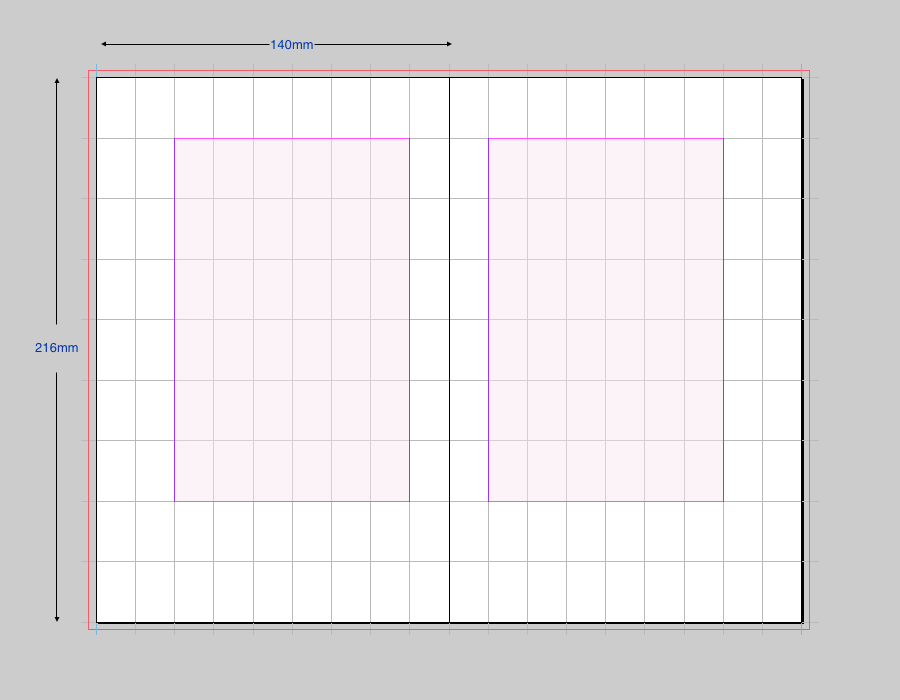
The margins are calculated by dividing the width and height by nine. Thus we get:
topMargin: 216/9=24mm Bottom margin: topMargin x 2=48mm innerMargin: 140/9=15.556 mm Outer margin: 140/4.5 =31.111 mm
You will also see the underlying construction lines that can also be used to make the text block sit harmoniously within the page. More on this here.
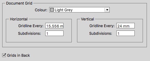
The grid is displayed on the InDesign spread by using the setting in preferences for the document grid.
Setting this up with InDesign is shown in the ‘new document’ dialogue below:
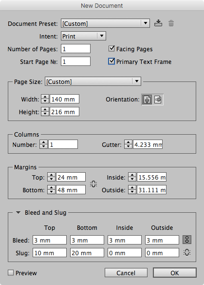
You may also notice that we are using a bleed of 3mm all around, so that content can extend beyond the page where we want images to the edge of the paper. We also use a slug of 20mm at the bottom. This is so that we can add some information to the PDF below the printable page.
Useful Information Alert: InDesign number entry fields are actually clever little calculators. You can enter a formula into the field and InDesign works it out for you. In the example above, you can enter ‘140/9’ into the inside margin box and InDesign then writes 15.33mm. Neat!
Baseline Grid
The baseline in typography is the imaginary line on which most letters sit. The descenders of letters will extend below this line. Also, the body of some letters such as the J and Q in some typefaces will also extend slightly below this baseline.
The purpose of using the baseline grid is to make sure that the main text will align properly across columns or across the spine of the pages when seen in a double page spread. There can be something very uncomfortable looking when the text appears on a different alignment. This is always particularly obvious when the text reaches the bottom of the page. When the book is printed on thin paper, the text may be seen through the page; if the lines of text coincide (back to back), then this will be less noticeable.
There are several steps and various options for aligning the text to a common baseline grid.
Baseline Grid Preferences
One way to set the baseline grid in under InDesign>Preferences. You can start with this method, and change as you see for the whole document. You will notice that there is no way to preview this, so you need to set this up, go back to your pages and use the menu View>Grids and Guides>View Baseline Grid.
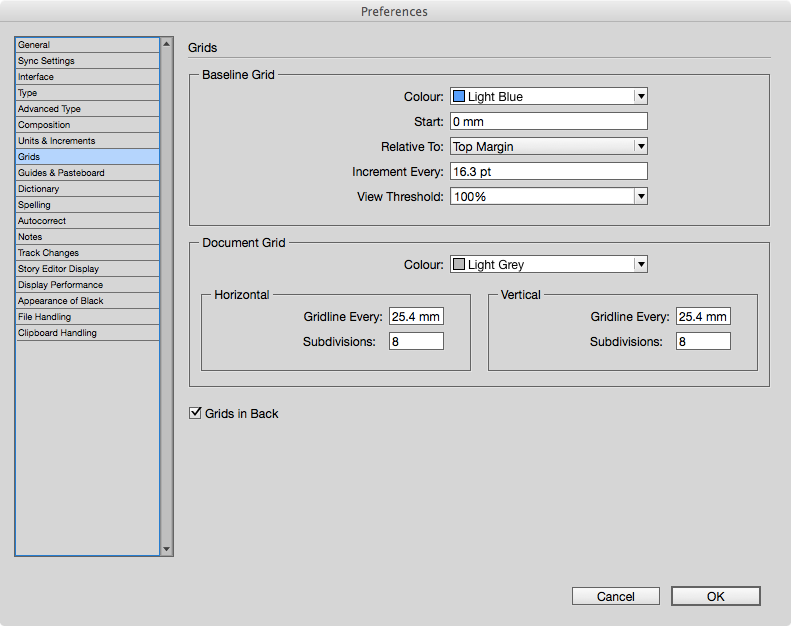
The critical options for you in the Grids Preferences are where the gridlines begin (Start and Relative To:), and the increment. You probably want the gridlines to begin at the top of the margin. Once you decide to align the text to the baseline, then this will take precedence over any other settings, such as the leading on the paragraph.
Note: You are normally setting the baseline grid increments to the leading of the body text. If the leading of the body text is set to something smaller than the increment setting, then this will be ignored. When the leading is set larger than the increment, then the lines of text will skip one baseline.
The Space Before and Space After settings for the paragraph will also be over-ridden by the baseline grid. To align the text to base line grid you need to choose from the options found in Paragraph style palette for Indents and Spacing.
Some features of the the baseline grid can be somewhat confusing, since your chosen units may be millimetres, but the baseline grid is always set in points.
Baseline Grid and text frames
So far, we have looked at setting the baseline grid in the global settings. This is not ideal, since the setting is not tied to the document, but rather to your preferences.
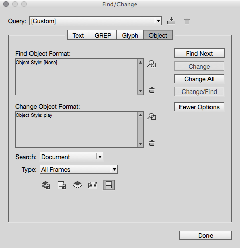
A better way is to set the baseline grid for the text frame(s) and this is best done on the Object Style. Setting an Object Style for all of your text frames where the text is threaded throughout the document will require and extra step.
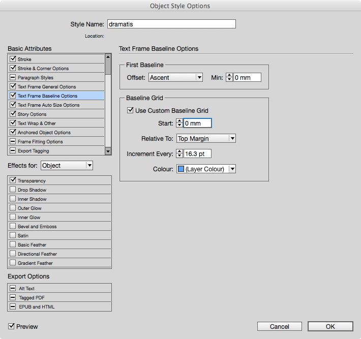
The way to apply an object style on a great number of text frames is to use the Find/Change dialogue and choose Object — Search for all object that are using an Object Style of [None], and applying your new object style to all.
Typography isn’t Just about Fonts
Some designers believe that we have too many typefaces available to us, and this may well be true. Your job is to choose type appropriately. Don’t over mix styles in the same book. Recognise that headings, titles, captions and body text all have a different purpose in the book and on the page.
Paragraph Styles
InDesign uses the term paragraph, to mean any type element that lives in its own line — begins and ends with a paragraph break. This means a paragraph (of course), but also a heading, sub-heading or even a list item. Paragraph styles should be set for every different type of paragraph or heading. InDesign, does give us the means to control all aspects of a paragraph, but ultimately, it is best practise to build a style for consistency throughout the book.
Paragraph Indication
There are 2 common ways to indicate that a new paragraph begins.
- The often used method is to have the first line indented by about the height of an uppercase letter of the typeface being used. In typography speak this would be 1em. In 12pt type 1em is equal to 12pts. However, you will need to choose a dimension based on your preferred units (millimetres possibly). If you use this style rule for body text, then it is desirable not to include this first line indent on the first paragraph following a heading. This means that you need a different style for the first paragraph that follows the heading.
- Another way to indicate a paragraph is to have a space before or after each paragraph, but it is often suggested by typographers to not use both of these methods together (ie, don’t have a first line indent and a space between the paragraphs).
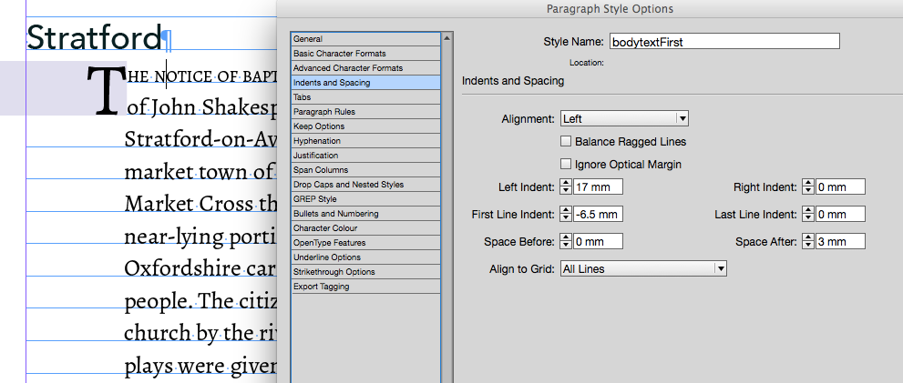
The first paragraph in a section or chapter is often treated differently with a drop cap for the first letter, or different treatment for the first line or range of words.
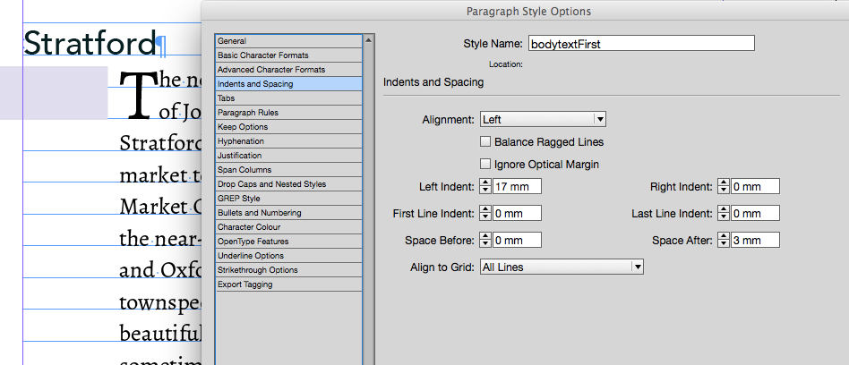
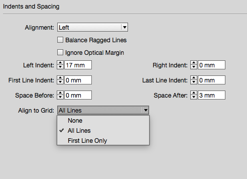
The image here shows the left indent of 17mm for the whole paragraph and a Space After of 3mm.
Drop Caps and Nested Styles
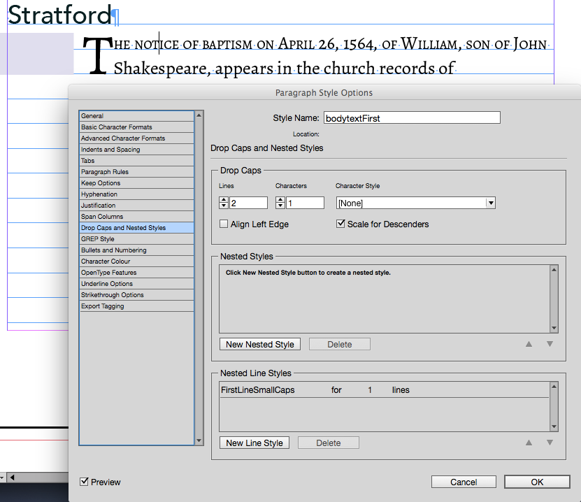
This image shows how we can set up a Drop Cap through the Drop Caps and Nested Style palette. This also shows that we can create a style for the first line of the paragraph. If you prefer to only style the first few words, then use a nested style rather than a nested line.
Paragraph Alignment and Spacing
Apart from distinguishing one paragraph from another, we should also pay attention to the space around the paragraph and how the type is aligned left, right top and bottom.
In the ‘Indents and Spacing’ section of the paragraph style panel, we have a great number of controls that we should now explain.
Alignment
These choices really take the paragraph as a whole and organise the letters, words and lines to present the block in a variety of ways. The standard way to present a paragraph of body text is to have the left edge aligned with the right side not aligned at all, but be as ‘ragged’. This means that the text flows naturally, with each line breaking when it runs out of space in the column.
You can see the various choices of alignment here, and it is better if you experiment with these to see the results for yourself, however, there are some important things to consider when using any of the Justify choices.
Justification
Justified text may look awful because InDesign needs to space the words out along the line in order to achieve alignment both left and right. If the column width is narrow, then this can cause large spaces to appear between the words. There are some ways that we can further control this Justification.
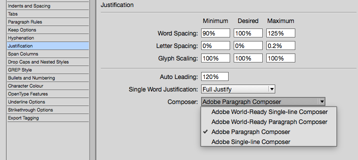
Under the Justification section of the paragraph style panel you can choose which method that InDesign uses to calculate the spacing to achieve alignment left and right. By choosing the Adobe Paragraph Composer, InDesign will go through the whole paragraph to help decide where to adjust word spacing.
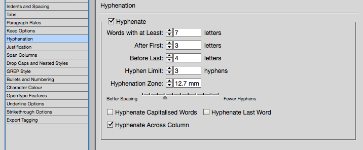
Hyphenation
Hyphenation can be used to break some longer words between lines. Using hyphens can resolve some spacing problems between the words, however, hyphenation comes with its own issues such as visual unpleasantness when too many lines of text end with a hyphen.
InDesign can use more sophisticated algorithms to calculate where to best place the hyphens and under the Hyphenation menu, you will see many choices. See below for further information on hyphens.
First Line Indent
This was previously mentioned in relation to new paragraph indication, but it also important to understand the relationship between it and the Left Indent. As you can see in the following screen image, we can use a negative First Line Indent, to shift the first line to the left of the indented paragraph. Notice also, that we can even use fractions of millimetres!
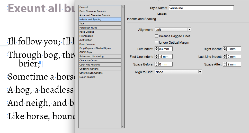
This is also very significant where we are styling lines of verse or poetry, because we are, effectively dealing with individual lines as paragraphs, and, although we are not often likely to see those lines wrapping around to the next line — when they do wrap over, it is useful to emphasise that the lines belong together.
Poetry, Verse and Song
We can set verse with 2 possible techniques — we can either set each line with a paragraph break at the end of the line — or we can use a forced line break (using Shift-Enter) keeping the verse or stanza in one paragraph. There is a significant advantage when setting each line as a paragraph, though — it means that we can use first-line indent and left indent in combination to get effective wrap control over the long lines in verse.
With each line as a paragraph, we can use space-before and leading in combination to show the difference between the space between lines and the space when lines wrap.
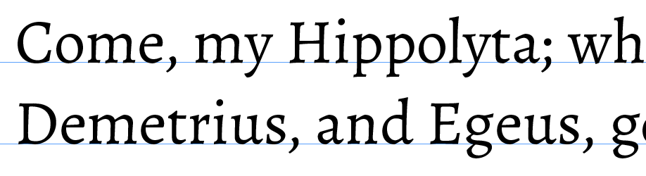
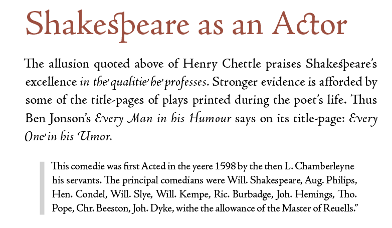
Here we see where a line of verse has wrapped on to the next line. We have used a smaller leading in the style to bring the lines together. We have used a negative first-line-indent to set the second line in from the first. In our Shakespeare Play example we need to know the difference between verse and prose. Some of Shakespeare’s plays have more of one than another, but many have a good mixture of both.
If we have received text from a facsimile edition — that is, the text is scanned and converted — we are likely to find that long lines are broken with a paragraph break. We must remove these artificial breaks because our prose text must be allowed to freely flow and only break when it reaches the eight hand edge of the column.
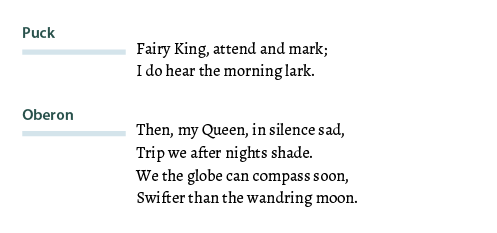
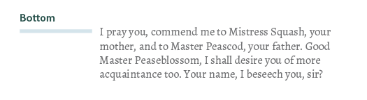
Here is an example of verse in our play ‘A Midsummer Night’s Dream’.
And here is an example of prose spoken by Bottom.
Keep Options
In the paragraph style options you will find the Keep Options section. From this panel we can determine that a topic heading (in our play this is the Act or Scene start) will always start with a new page. We can also control orphans and widows from these paragraph settings.
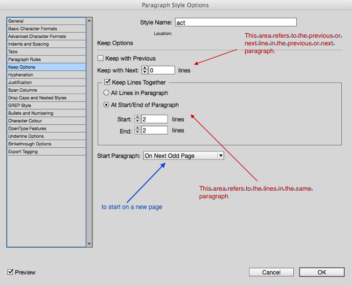
Starting a New Page
As with most page layout and word processor programs, we can enter a page-break, where we want to force a new page. However, it is better to make this a function and attribute of the style for the heading. It is often the case that we want a chapter or section heading to begin at the top of the recto page (the right-hand page in a spread). InDesign has this feature and we can see in the following image how we have determined that the Act in our play will begin on the ‘Next Odd page’ — the same as recto.
Widows and Orphans
Widows are those items that are left all alone, either at the bottom of the page or at the end of a paragraph.
If a single word appears at the end of a paragraph, on its own line, then it is said to disturb the balance by providing too much white space. (This is sometimes referred to as a ‘runt’.) When the first line of a paragraph appears at the bottom of a page or column, then, again it is a widow and gives a poor reading experience.
One word at the end of a paragraph and one line at the bottom of the page, are both undesirable, but are, not only, difficult to control, but have very different approaches.
Widows at the word/paragraph level can be controlled by making the space between the last two words in a paragraph a non-breaking space. You can only resolve these individually as you encounter them at the very end of your design process. This will then ensure that there are at least 2 words on the last line. Alternatively, you can use the Balance Ragged Lines attribute of the paragraph style. This is found under the Indents and Spacing section of the Paragraph Style palette. This latter method does impact on all lines in the paragraph though!
InDesign provides the typesetter with ways of determining how many lines of a paragraph should be left behind on a page (orphan), or how many lines should appear at the top of the following page (widows). Gone are the days when we would adjust leading or font size, just to get the single line back onto the previous page!
InDesign does not use the terms Orphans and Widows (annoying), but rather uses ‘Keep with Previous’ and ‘Keep with Next’.
We need to look carefully again at the Keep Options part of the paragraph styles palette.
Using these features can be rather disconcerting, because small changes may move our text in a very dramatic way. My advise is that you work from the beginning of your text in InDesign and try to resolve these issues from the first pages. If you are previewing changes at a later page, your visible text, will suddenly disappear as earlier text is forced to shift on to new pages!
Further Details in the text
Hyphens and Dashes
When text is typed or is scanned from a book, the hyphens are likely to be simple dashes or minus-signs. Like this -. This may be OK for some situations but there are other forms of dashes that are used in different contexts.
Hyphens are used to join words together making a compound word. An examples might be Love-lost or milk-white. The hyphen is also used when words are broken through hyphenation across 2 lines. This is usually and setting in our typesetting software, so that the hyphens are generated automatically. Hyphens do not have space around then but they can be slanted in some typefaces.
The en dash is a line slightly longer than a hyphen and used to indicate between as in 1979–80. It can have space around it as in 1979 – 80. The en dash can also be used to indicate a parenthesis as in we hoped for a white Christmas – rare in England – so we could make a snow-man.
The em dash can be used in the same way as the last item above. The em dash is longer and is used in a variety of contexts but often used at the end of a line to signify a pause before the next line is spoken or read.
An example from ‘A Midsummer Night’s Dream’:
Of great revenue, and she hath no child— From Athens is her house remote seven leagues—
Hyphenation
It is important to realise that hyphenation should be used in InDesign with attention to detail. Here are some issues to consider:
Hyphenation is only really necessary when the line lengths are short and justified alignment is used. Hyphenation can help avoid large spaces between words. When text is set to justified, then the typesetting software will adjust the word spacing (line-by-line) so as to make the paragraphs align both left and right. If your text is left aligned then hyphenation is usually unnecessary.
Hyphenation should not be used in headings.
If you do use hyphenation then the typesetting software can control certain aspects of this.
- You should turn off hyphenation for capitalised words, so that countries and person’s names are not broken between lines.
- You should turn off hyphenation across columns (pages), so that words are not broken across page breaks.
- You will want to be sure that the last word in a paragraph does not hyphenate.
- InDesign has a sophisticated hyphenation controller; you can decide how long a word needs to be before you allow to hyphenate.
Typographer’s Quotes and Apostrophes
In a text coming from a scanned source or an author’s work from simple word processors, the quotes around speech or citations may be unacceptable straight marks. They might look like "this". Whereas they should look like “this”. Apostrophes have a similar problem because they might be straight like I've, they should look like this I‘ve.
InDesign can resolve this 2 ways.
- When you place the text, be sure to switch on
Typographer’squotes before placing (use the Options panel). - You can use the ‘Find/Replace’ dialogue box and find the ready-made query that will replace all straight quotes with curly ones and straight single-quotes to single curly ones.
OpenType features
If the font you are using is of the Opentype variety, you will be able to invoke some more appropriate characters and glyphs. One example is numbers. Numbers will look better as ‘proportional old-style’ if they are within the text. The numbers will align themselves to the lowercase of the font rather than use the same height as the uppercase letters.
In the illustration seen here, the font used in the paragraph text is Minion Pro; this is an opentype font and so we can use proportional old style numbers.
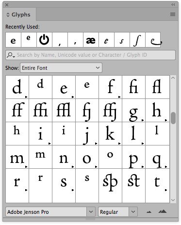
Other aspects of the font they you may wish to use (for even greater attention detail) are Ligatures and Kerning.
Ligatures are essentially special glyphs that exist within the font that are characters put together. The example shown here includes the letters s and t that in their special form are joined together. You can see the available ligatures in the glyph table of the font. Only well prepared fonts will have a full set of ligatures. Here we see the example of Adobe Jenson Pro in use.
Kerning is a setting within InDesign for the paragraph style that will adjust letter spacing for certain characters. The letters A and v, for example, should be optically set rather than using the metrics setting.
Filed under: InDesign, Typography, Design and Production
This page last edited on: 2017-12-05