Using Photoshop and InDesign to Create a Cover for Print
Contents
Objectives
We need a print ready PDF of the full cover for a paperback book with image (optional) and title on the front and some blurb on the back.
We will need some assets, such as images and text and we will use Photoshop to modify any images that we intend to use. We will use InDesign to prepare the PDF ready for print.
Note: It is presumed that you have downloaded the files from the GitHub repository here.
Your task (once you decide on the play to use) is to design a cover with the following steps:
- Use a new blank Photoshop file with the size 198mm x 129mm (portrait and 300dpi)
- Arrange in that space the title of the play
- Keep it simple at first and use layers to try different versions
- Try colour for the text
- Possibly add an image on another layer
- Make sure that there is enough contrast between the image and the text
- Optionally add further text (Shakespeare, quotes from the play etc)
Once you have some clear idea for your design you can now use the provided template that represents the full cover (back, spine and front). You can use this to further develop your ideas for the whole cover that might include an image that goes around the spine and the back.
Our page size
Some maths
We are using a book page size of 198mm x 129mm. We need to double this and add a spine (for this book we will choose a spine of 12mm) and a bleed of 3mm. We need a bleed because the image on the cover will go right to the edge and be trimmed.
Ultimately we need an InDesign document for the complete cover, and we provide a template for this, using these dimensions. If you want to mock up the cover using Photoshop (because you want to use images or painterly techniques) then you need a template with the following dimensions.
Making the calculations we get:
Height = (198+6) = 204mm
Width = [(129x2)+12+6] = 276mm.
These are the dimensions we use in Photoshop so that we can simulate the full document that we use in InDesign.
**You will find a Photoshop template in the module repository for this. **
**Note: **Optionally you can create a Photoshop blank just for the front of the cover. This needs to be 198mm x 129mm in 300DPI.
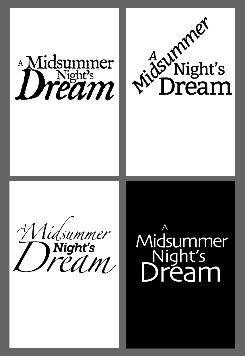
Here are some images that show how you can use the suggested Photoshop blank to try different options for your play title typography.
Prepare our main image in Photoshop
We are using the Folger picture library to obtain an image for the front of the cover. These images are good quality, but the free versions are not really print quality. To obtain high resolution images we would need to pay for them. For our purposes (making a design prototype), we can use the best quality free version.
We go to the web site (http://luna.folger.edu) and search the database for our play.
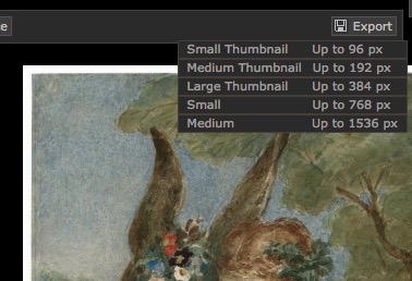
We can export the Medium version. The large version is not available to us.
Start Photoshop from the dock, but before anything else be sure to set the following preferences:
Units & Rulers - use millimetres for the rulers and points for type
Open the Photoshop template file (FullShakepeareCover.psd)
The image downloaded from Folger can be opened in another Photoshop window and after selecting all, copy and paste into the newly opened file. This gives us a new layer.
Because this image is too small (only 72dpi), we need to enlarge (use Edit>Transform>Scale). This would not be required if we were to purchase the higher resolution version! Photoshop does a reasonable job of keeping the image sharp after enlargement.
Further effects in Photoshop
We can create further layers in Photoshop to add tints or blends.
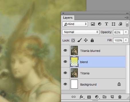
Layers
The more layers that you use the more flexibility in the design you will have. Create a new layer by clicking the Create New Layer icon at the bottom right of the layer panel. Lets create a gradient or blend of colours in that layer. The gradient tool is in the centre of the tools panel. You need to decide on a direction for the blend. You can either go from the foreground to the background colour or from the foreground to transparent.
Save the Photoshop document so far. Now we move on to:
InDesign
We could possibly continue with the work on the cover in Photoshop - adding text and possibly more images, but for this exercise we will give InDesign the chance to add the text.
Open the InDesign template by double clicking the file - cover.indt
As you can see, you have one page landscape with 2 columns, a gutter of 12mm, 6mm margins and a bleed of 3mm all round. We have also added a slug top and bottom so we can add a name and the fold marks.
Save this new InDesign document together in a location with your images.
Place the main cover image
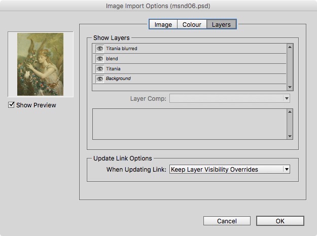
When you use the Place menu, tick the Show Import Options switch so that you can see some of the options before the image arrives!
As you can see here, the layers from the Photoshop file are shown and, optionally we can turn some off, if we just want a part of the image. I have turned off the gradient layer, because we can add this within InDesign. This will give us greater flexibility.
We can also ‘place’ each layer separately so that we can further edit the position of the separate items.
Adding the Main Text in InDesign
When you use the Type Tool and drag out a box, you will create a new layer for the text.
I usually work on the pasteboard for this. Write out the name of your play (A Midsummer Night’s Dream) and help yourself to a typeface and adjust the size. Our objective is to separate out the text elements, so use ALT-drag to duplicate the text box, then you can delete some of the text in each.
Keeping each text element separate gives you the freedom to build a more inspired arrangement of words.Try changing colours, weight, point sizes and letter-spacing.
Spine Text
Create the text for the spine and rotate this 90º Clockwise. Add other text and images for the flaps and a barcode for the back. You can add placeholder text, if you just need to make a mockup and determine the number of words needed for the space.
Key Points to Remember
- Get inspiration from other book covers and jackets.
- Sketch your ideas for the cover on paper, but we do need the whole spread.
- Use layers in Photoshop to build up your main image.
- The title of the book must be prominent. Make it readable over whatever else is on the page.

Break the text of the title into individual words so you can arrange creatively.
The spine text needs to fit in the 12mm width and it is rotated so as to be readable when the book is horizontal with the front uppermost.
Optionally, you can use the text from the cover for the title page.
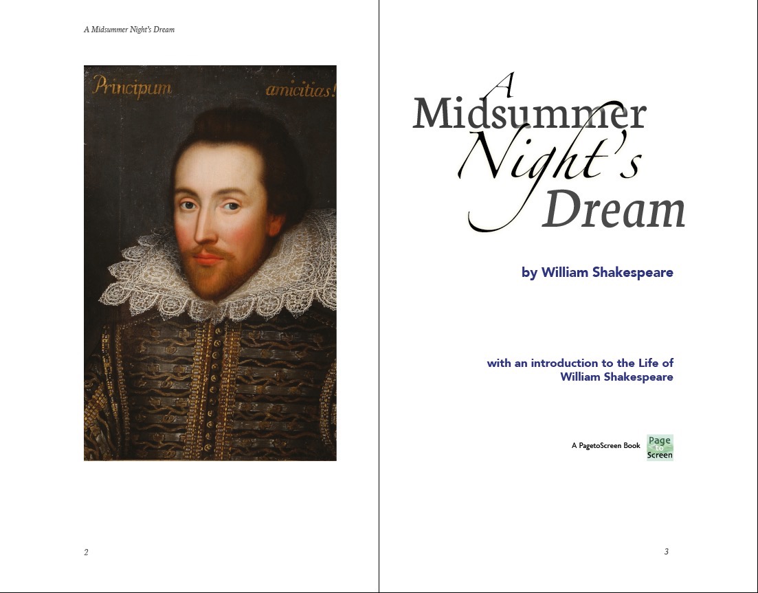
Cover text re-used on title page
It is a good practice to use some aspects of the cover design on the title page.
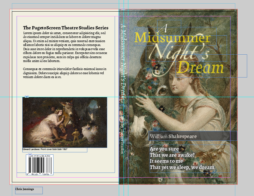
The InDesign document showing the bleed and slug.
Filed under: InDesign, Typography, Design and Production
This page last edited on: 2018-09-25